Vaughan Oliver retrospective exhibit at Lesley University, Sept-Oct, 2017
If I had to sum up the work of maverick graphic designer Vaughan Oliver in a single phrase, it would have to be “jolie laide” — drolly defined by literary critic Daphne Merkin as “a triumph of personality over physiognomy, the imposition of substance over surface.” (It can also be translated, roughly, into “beautiful ugly” — apropos, in this case.)
Emerging as he did out of the punk scene of the 1970s, Vaughan took a “fucked-up and photo-copied” approach to design. When 4AD founder Ivo Watts-Russell decided that his nascent record label needed a consistent (and consistently surprising) visual identity, he chose Vaughan — as much for the latter’s surreal and iconoclastic sensibilities as for his typographic precision. (His sensitivity to illustration and photography was also enticing.)
And the rest, as they say, is history. Vaughan turned 60 last week, and — though decidedly not a rester-on-laurels — he has begun to enjoy a new wave of accolades.
What I was seeing was exactly what I wanted that music to look like.” -TIMOTHY O’DONNELL

Graphic design legend Vaughan Oliver (4AD/v23)
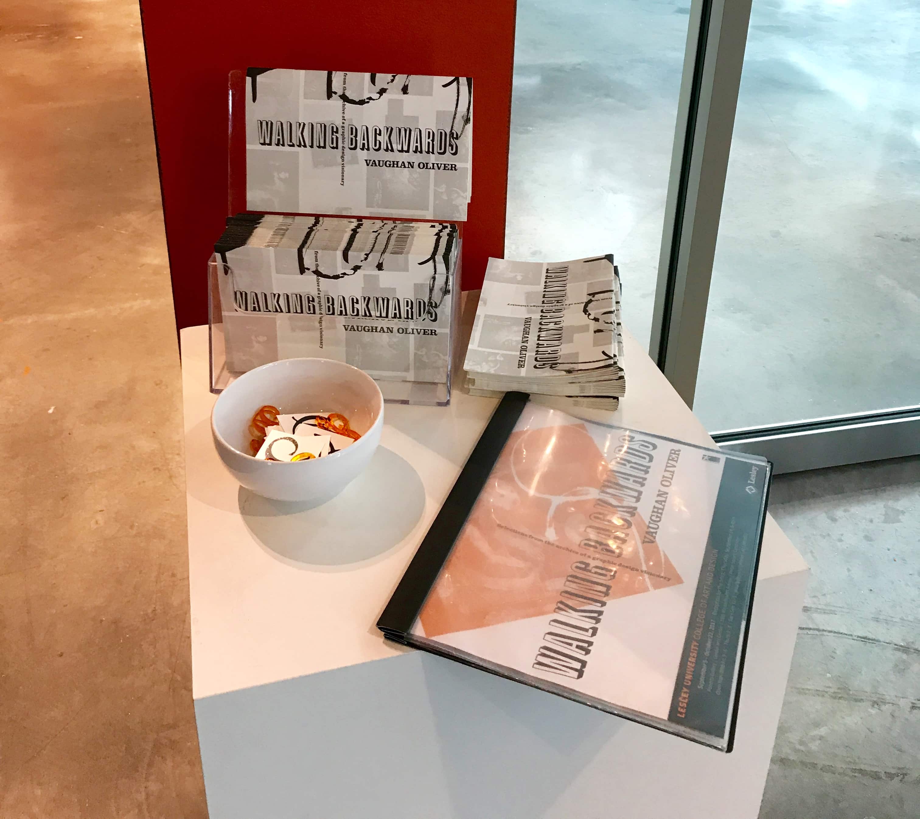
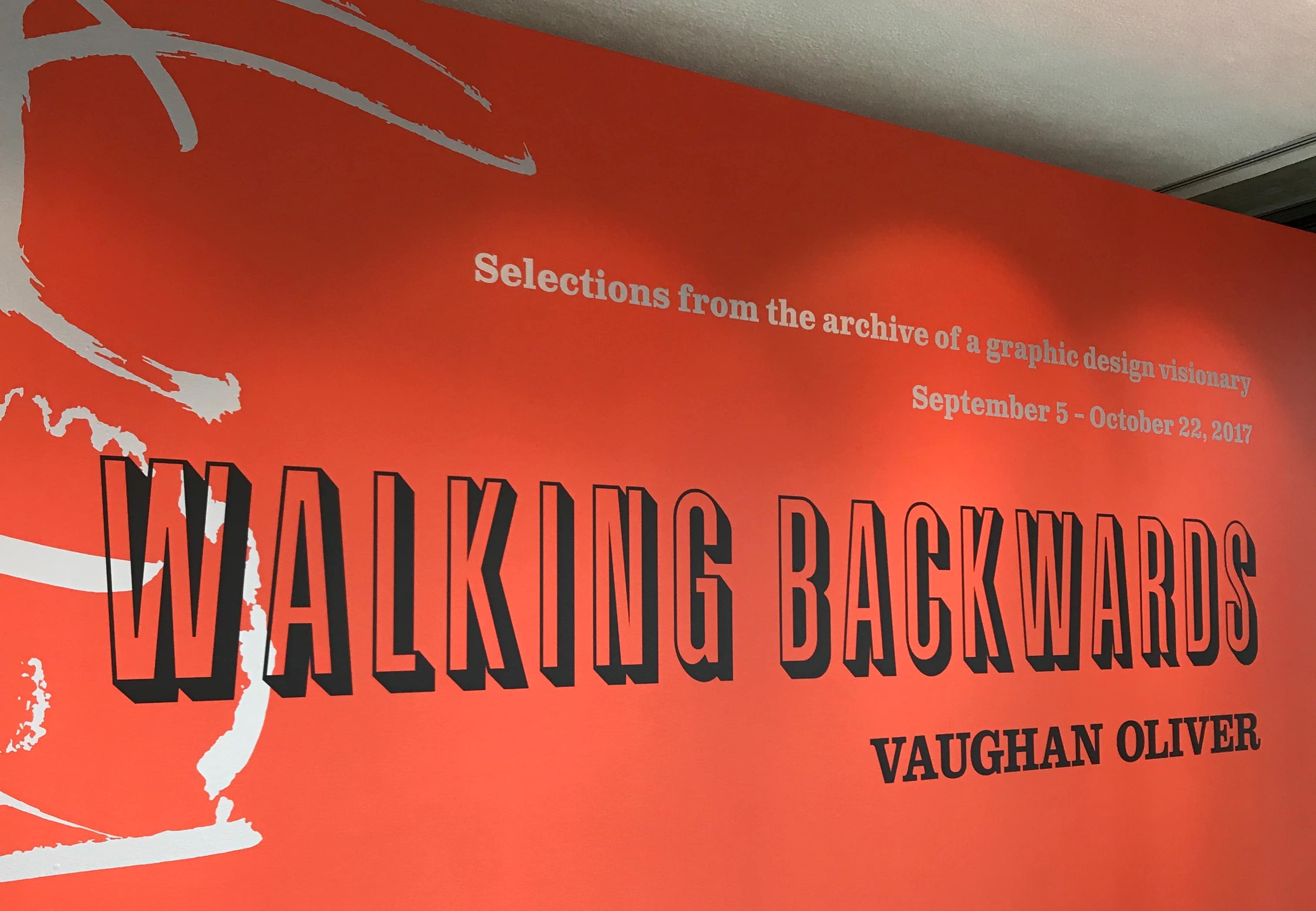
From September 4-October 22, Lesley University’s College of Art & Design in Cambridge, Mass., is showing “Walking Backwards,” a career retrospective of sorts that draws on Vaughan’s rich catalog of music design (LPs, posters and related ephemera), as well as book covers, fashion advertising and design monographs.
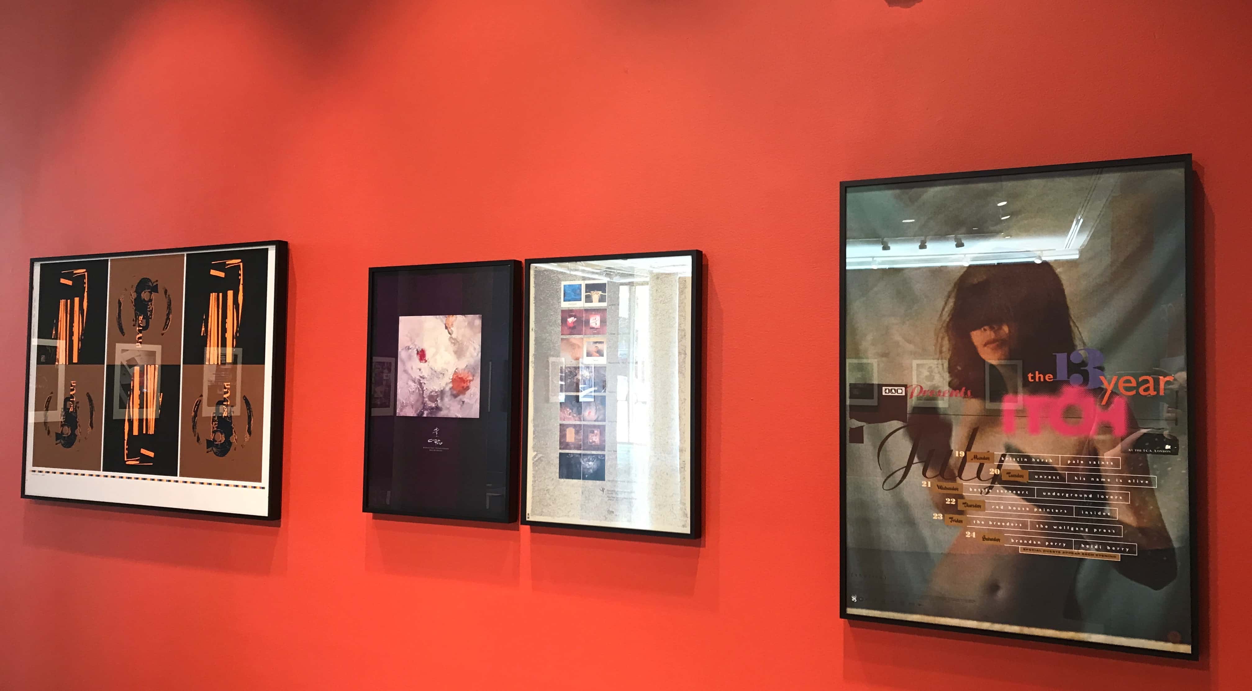
Seeing his work in one place is a gift that opens up resonances and affinities — threads that warp and morph through the years. Of course, there are constants: Asymmetry. Black humor (in the capital ‘S’ Surrealist sense). An enduring but non-pedantic love of revivifying lost, unfashionable or largely forgotten fonts. (See also: Vaughan’s aesthetic brothers-from-another-mother, the Quays.) Calligraphic, often Pollock-like swashes that enliven negative space. Smeared, stretched or otherwise manipulated elements, be they type, photo or illustration.
But Vaughan, ever-puckish, is a master of transforming outlandish, sometimes borderline unpalatable concepts into something transcendent. (For proof, pluck the Breeders’ Pod from your LP/CD shelf — that’s Vaughan, wearing a belt of eels and enacting some kind of primitive fertility dance on a Sunday afternoon.)
Pluck the Breeders’ Pod from your LP/CD shelf — that’s Vaughan, wearing a belt of eels and enacting some kind of primitive fertility dance on a Sunday afternoon.
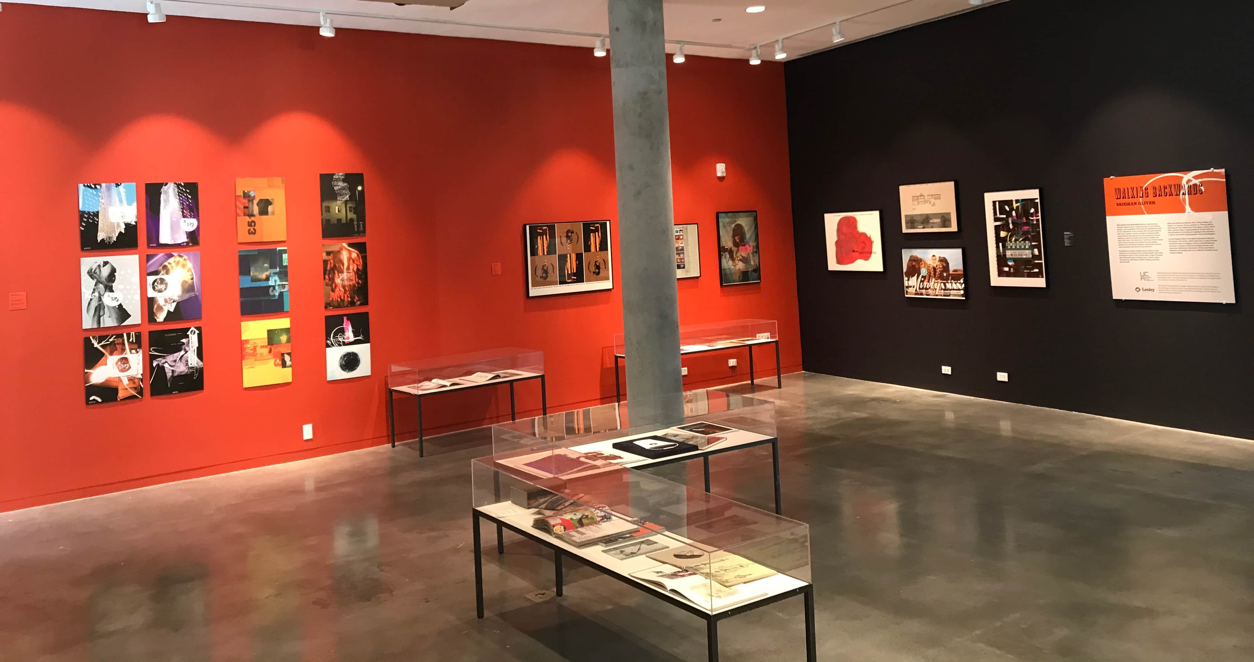
Gallery installation view, Lunder Arts Center.
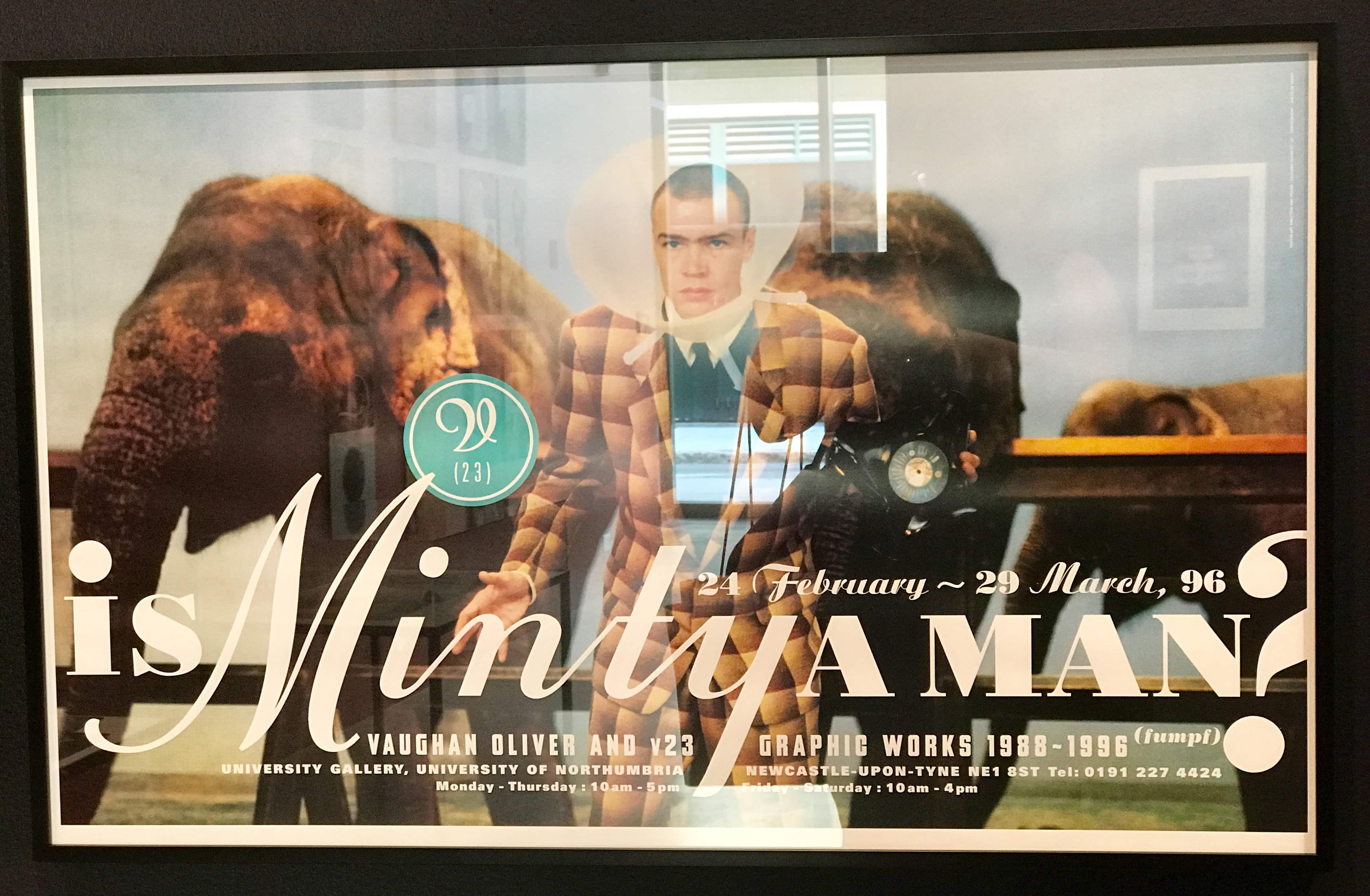
His style is always in the service of substance — particularly in the case of his music work, where he channels visuals so evocative that you can no longer tell where the design ends and the music begins. To put it another way: Just try to imagine the Cocteau Twins without the visual language that 23 Envelope (Vaughan and photographer Nigel Grierson, who worked together exclusively until Vaughan established the more open-ended v23 in 1990) created. Of course, the Cocteaus’ music is extraordinary on its own, absolutely, but there’s a complementary pocket universe that exists inside those record sleeves. It’s a kind of alchemical magic that Vaughan and his collaborators create, over and over again.
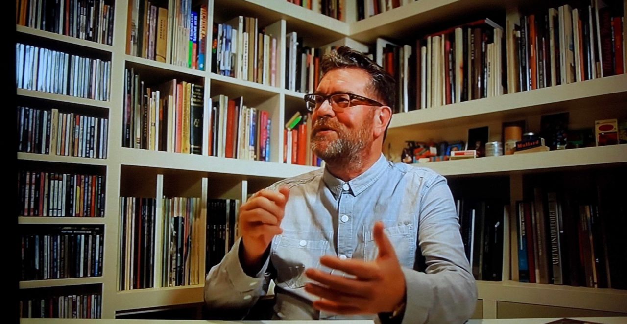
At a panel on Friday night, a group of Vaughan’s colleagues attempted to diagram his genius. Timothy O’Donnell, who worked for v23 for 5 years (including design credits on records by Bush, His Name Is Alive, and Tarnation, among others), described the revelation of picking up Victorialand by the Cocteaus: “What I was seeing was exactly what I wanted that music to look like. There’s something going on that you’re never quite going to figure out, but you’ve been dropped into the middle of it.” Flipping the record to the back, the lack of a bar code — the “exit sign” on any record, signifying its commercial value — was equally revelatory: “The fact that these objects were completely removed from that world was doubly powerful to me.”
“Key to the work is an air of mystery and ambiguity,” Vaughan told students at a Friday workshop. “‘What is that?’ I kind of like that, because it puts a hook [in your mind].”
Photographer Dominic Davies once described Vaughan’s typically surreal creative direction thusly: “He rang up and said, ‘Dominic, we need something a bit urgh! And a bit ooh!’”
A bit urgh, and a bit ooh. Well, that it’s then. Happy (belated) birthday, Vaughan.
Note: Lesley design professor Kristina Lamour Sansone mentioned that plans are underway to publish the first volume of Vaughan’s archive in 2018. Watch this space for details of that crowd-funding effort.
RELATED
4AD: The First 20 Years
Delirium As a Form of Higher Expression: His Name Is Alive
Sweet Ride: Belly’s Triumphant Return
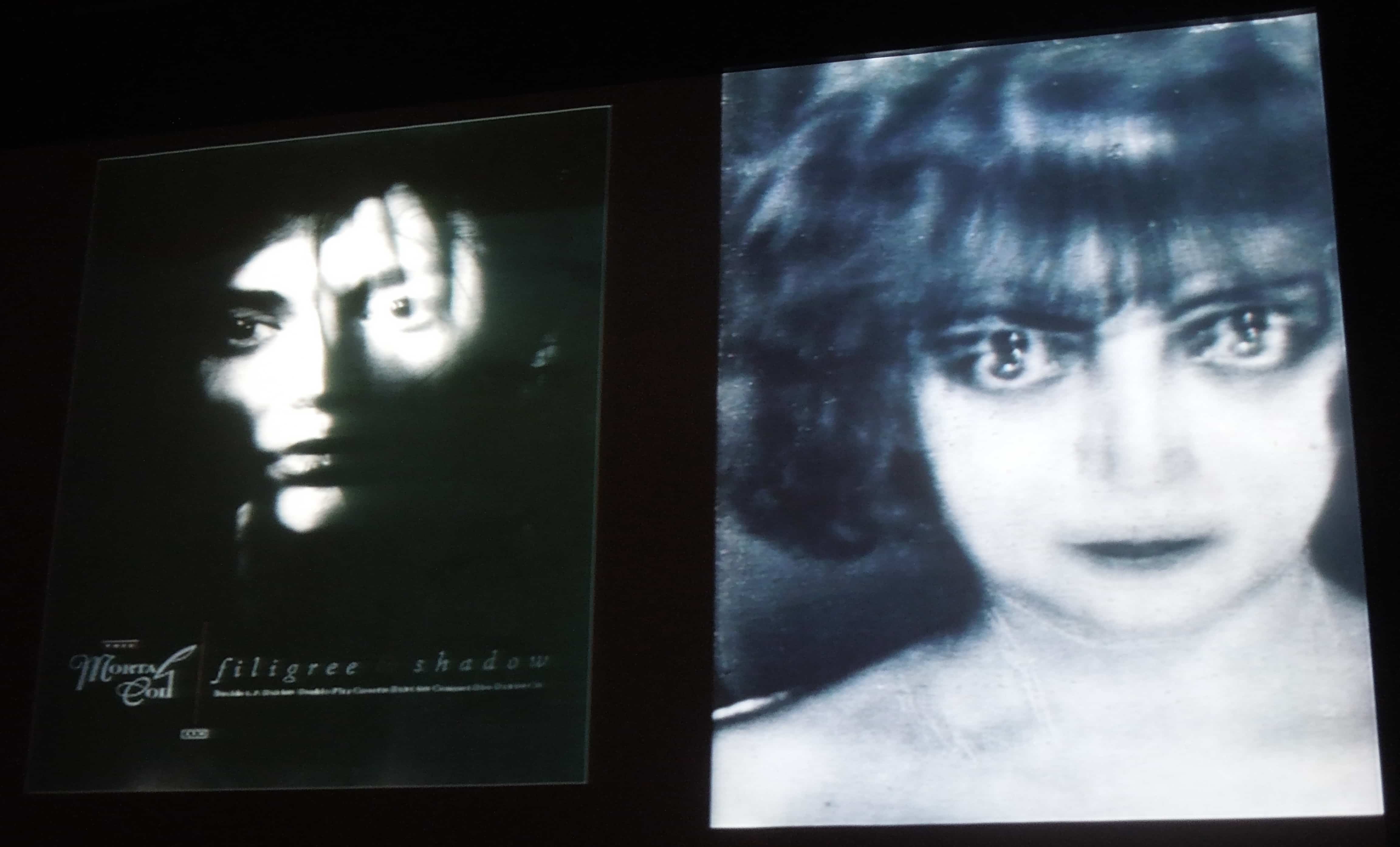
Visual affinities: Pallas Citroen on the cover of This Mortal Coil (left; photo by Nigel Grierson) + the Marquise Casati by Man Ray (right)