When Belly reunited in 2016 after 20+ years, they didn’t waste time hinting that they might have new material in the works.
Initially, the band floated the idea of an EP. But at some point, they clarified that the songs they were happily toiling away at in the Rock n’Roll Control Center (AKA bassist Gail Greenwood and partner-in-crime Chil Mott’s vintage bungalow) had actually blossomed into a PROPER LP.
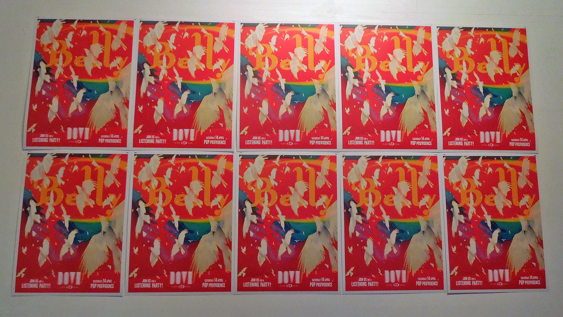
Dove, the first new Belly recording since 1995’s King, arrived this spring, and the band are now on a multi-prong tour across the US that extends into early October.
Rather than talk about Dove, hailed by Pitchfork as a “fusion of grace and force” and covered pretty extensively elsewhere, I asked the band to discuss the creative process behind the creation of the album’s artwork.
Belly ca. 2018 is a staunchly DIY effort — everything from social media to tour booking is being handled by the band, with a few exceptions. Artwork duties were undertaken by drummer Chris Gorman, who contributed photos to all the Belly releases put out by 4AD/Sire in the 1990s, and Chil, who has for years been a design and production guru at Greenwood Associates. Take it away, Chris and Chil!
How did you kickstart the process of designing Dove?
CHRIS: Technically, everything starts with the music. Having a solid foundation of completed songs does provide inspiration as well as incentive.
For Dove we definitely wanted to continue on the visual path we established with v23 and Chris Bigg (who designed all of our collateral when Belly was on 4AD) but an essential element of our reunion was to bring as much under our control as possible. Our writing, our production, our art, so it was never really a question as to who would do the design work.
CHIL: I think musically and visually the band wanted to keep a tie to their past without being constricted by it. Chris Bigg is an icon and there is no way to ignore the amazing work he’s done with this band and many others. If you try to directly emulate his work, though, it will inevitably end up as a second-rate knock-off.
The main continuing theme from past to present, though, was Chris’ photos — I just let them lead. Like all designers my main concerns are color, composition and narrative and I let that take me where it wants.
CHRIS: Without a label, we have no outside powers with influence over how we want to do things. We have professional designers and photographers within the band, so there was no reason to consider other options.
Chris Bigg really did wade through a heap of images for Star and all the subsequent EPs, singles, posters and other formats. Typically, his only direction was, “Can you send more?” I didn’t care how he used my images, and I think he thought my stuff was odd enough that he could always find something useful so long as he had free reign to crop, rotate, combine and layer design elements without any issues about marring a “perfect image.” Along the way, we did end up establishing a unique visual identity that is firmly attached to the sound of the band.
Each album has been impacted by my own technical ability as a photographer. Star was all 35mm SLR images processed at a 1-hour lab. King featured all 4×5 chromes and Polaroids.
Dove, by contrast, is a strictly digital affair. I was certainly more focused, having spent the last decade or so as a commercial photographer. I spend a lot more time refining images now before they see the light of day, and I go to a shoot more prepared — with more focused ideas in mind.
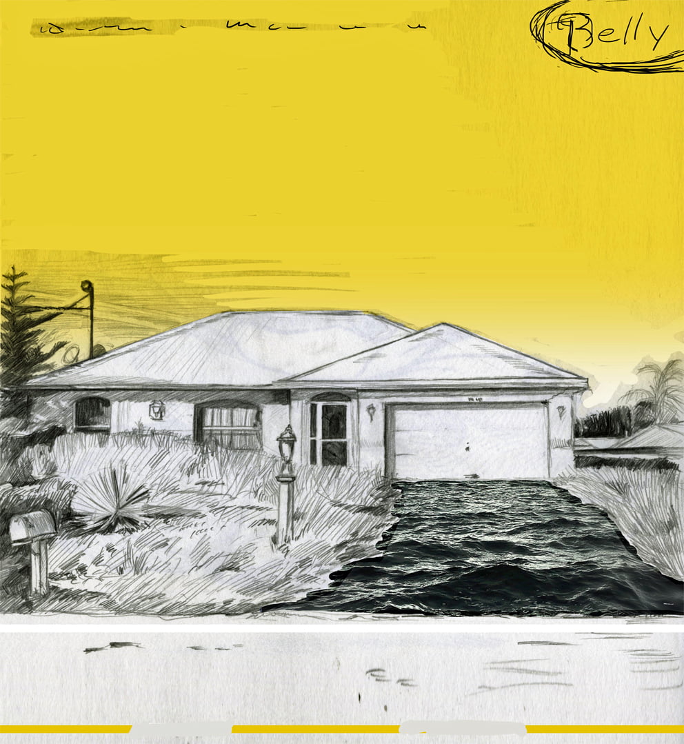
Certainly, having the music and vibe of an album swirling in your head when you hunker down in the studio really does guide you in a way that’s hard to quantify. We started the art process before the album was named, so the “Green Man” was the first refined series of images I worked on.
Dove, King and Star all feature objects I’ve collected or held onto since childhood. The Star dancers were from a box of dolls my sister ordered from an ad in the back of a comic book — 100 dolls for $1! The King dice and vintage tchotchkes all came from basements and yard sales. The “visible man” was an unfinished model from my parent’s attic that I always knew I wanted to use for something.
Each album has been impacted by my own technical ability as a photographer. Star was all 35mm SLR images processed at a 1-hour lab. King featured all 4×5 chromes and Polaroids. Dove, by contrast, is a strictly digital affair.
CHIL: Initially I did what I usually do — grab my sketchbook and start riffing ideas. I was originally thinking about poster design with imagery from the lyrics and ancient astrology. Comet was a potential title early on so I ran with that. Unfortunately I knew what I was coming up with wasn’t really fitting. Chris came over at one point and mentioned he was working with “visible men” and filling their bodies with flora. That sounded like a winner to me.
Early sketch using a more organic, hand-drawn look. Unused.
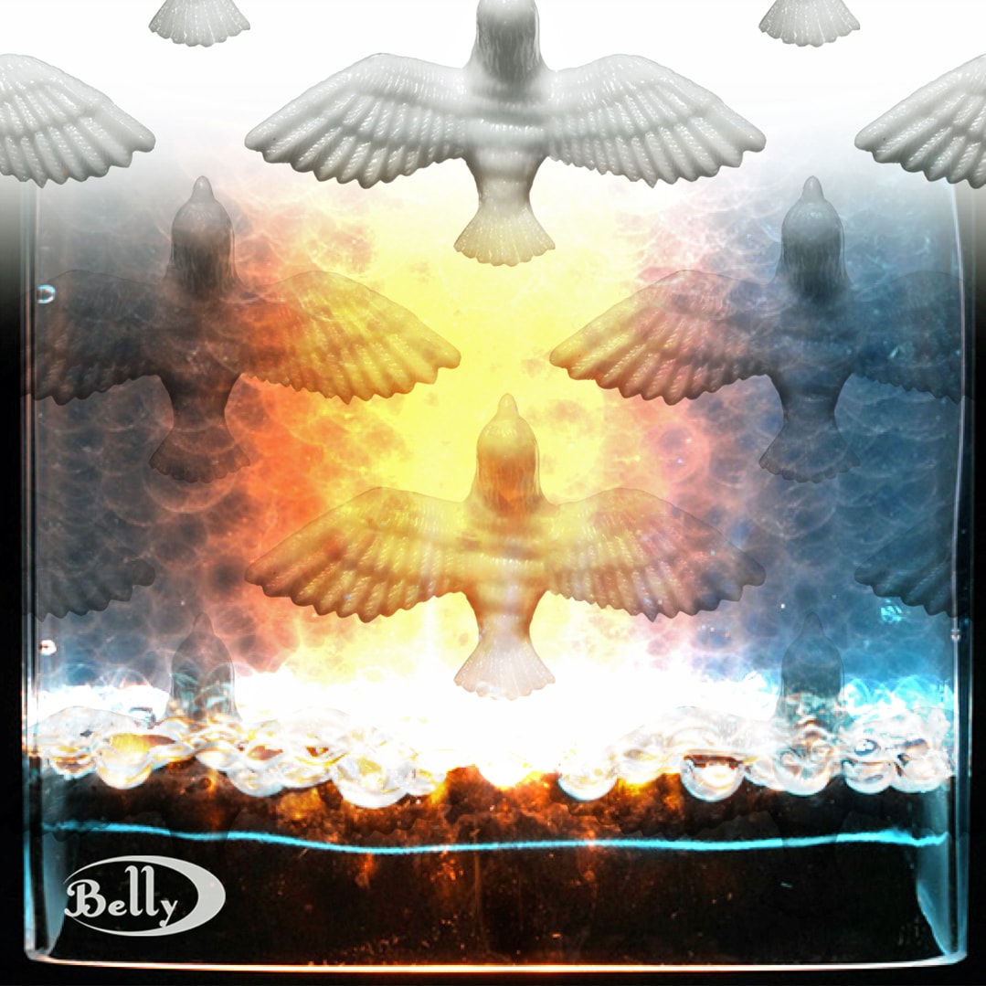
CHRIS: The orange/gold dove used on the cover came from the storage room of a flower shop where I worked in high school. They have a spot for wire on the bottom that would be used to wind around arrangements. The batch had started off clear but had aged into a weird yellow — these days more like a rich orange — so they were being tossed. I grabbed them and I’ve carried them around since the ‘80s.
There are even some test shots I did around the King era, so I imagine I always thought they might be a cool Belly prop. There was a test image that had the birds in a circle, and Tanya reacted to that when we first got back together. We used an illustrative version of the bird circle when we toured in 2016, and the bird image and icon resurfaced when we were writing the record.
One of my favorite things about Belly 2.0 is that most of you have been able to leverage your respective “day job” skills in the service of the band. Tell me how you worked together, process-wise.
CHRIS: Gail, Chil and I met up to look at all the previous Belly packaging, talking about our favorite elements but then we just left it at, “You go take pictures and we will see what happens.”
With most projects like this you just have to start somewhere and see where it leads you, especially when a lot of creative people are involved. For me having something to react to is more productive than just spitballing ideas. Experience has taught me that great designers react to images I would never expect, so I try not to edit much — my rejects can often end up in the final designs.
CHIL: Chris already had two books under his belt as well as working for years with Tom in their NYC photography studio, so I assumed that they would handle the official releases. But Tom was waist deep in music production (he did send me a folder with images that he was using for inspiration for some of his poster, t-shirt and web site ideas) and Chris reached out for help with packaging.
Everyone had a say in each step of the process. I sent out several possible designs and asked the band to rank them in order. I refined the top 2 or 3 a bit and repeated the process until we ended up with a winner. All 4 members had to be happy with the final outcome. If there was a “hrmph” I would rework it a bit more and start again. Gail may have had a bit more sway due to her proximity to my shoulder.
Escher-style army of doves sketch, unused.
CHRIS: When we started this process, I had just moved to the woods of southern RI from a mostly treeless barrier island off Long Island. So I was hugely inspired by the lush natural environment I was suddenly surrounded by. I was trying to sort out a cool way to use the visible man and I started replacing his skeleton with sticks and twigs and the idea just grew from there. (All the moss and flowers inside the man — and woman, dog, and frog — came from my backyard or our greenhouse or a local farm.) Everyone thought it was a striking image loaded with thought-provoking potential, so it gave me the starting point.
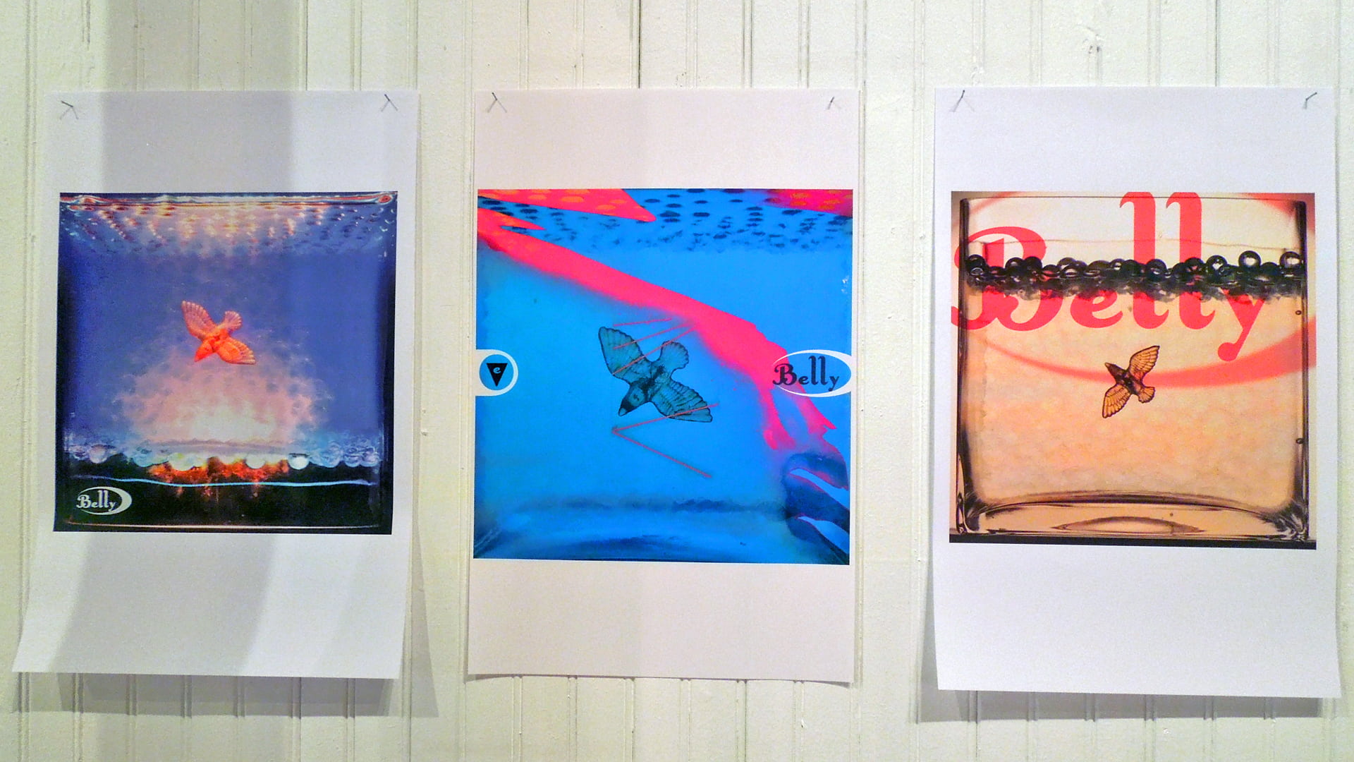
I worked on several different series until we decided on a title. At one point I took a few test pics of the plastic doves on different surfaces, but I was struggling to find the right way to shoot them. I wanted the bird to convey a sense of weightlessness and I also wanted an explosion of color and most of my attempts looked very flat so I set them aside.
Once the album title started to revolve around Dove — I already knew that Tanya had a soft spot for the little vintage birds — I revisited that idea. Even though it’s a little literal for Belly I knew it would be silly to discard them as a possible option.
As an inside observer I quietly sponged as much of the mood and feel as I could. Chris’ photos were all coming in with overflowing color and light, so that set a very easy course to follow.
One day my kids were playing with these orbeez water beads they got as a gift. They had huge bowls of them all over the kitchen and they started to fill all the glass flower vases with these weird water balls. We filled an oversize goldfish bowl with them and I saw the way the light was just glowing inside the bowl — they were transparent, translucent, semi-reflective. In water they become almost invisible but you can make them look solid. So I dropped a bird in the middle and it looked like it was weightless but also frozen in space. I knew I could do something cool with that.
CHIL: One of the benefits of living with GFG and being around the band is that I was able to see the growth of the new songs, hear them steer the demos, the final tracks and final mixes. They ended up with a distinct statement of strength in positivity. A difficult task in these ominous times.
As an inside observer I quietly sponged as much of the mood and feel as I could. Chris’ photos were all coming in with overflowing color and light, so that set a very easy course to follow. Whenever my default position for grim and overwrought would creep in, Gail would fire up a spinning back fist and get me back on track.
Any approaches that didn’t work as expected? Sometimes even a wrong turn can yield something that can be used later.
CHRIS: There are thousands of photos that were discarded along the way. Over the years I’ve learned to do a lot of work in my head before I pick up the camera, and I’m a lot more selective with the objects I choose to shoot. But I love to experiment with lighting and composition, especially with digital because you are viewing the results of subtle changes in real time.
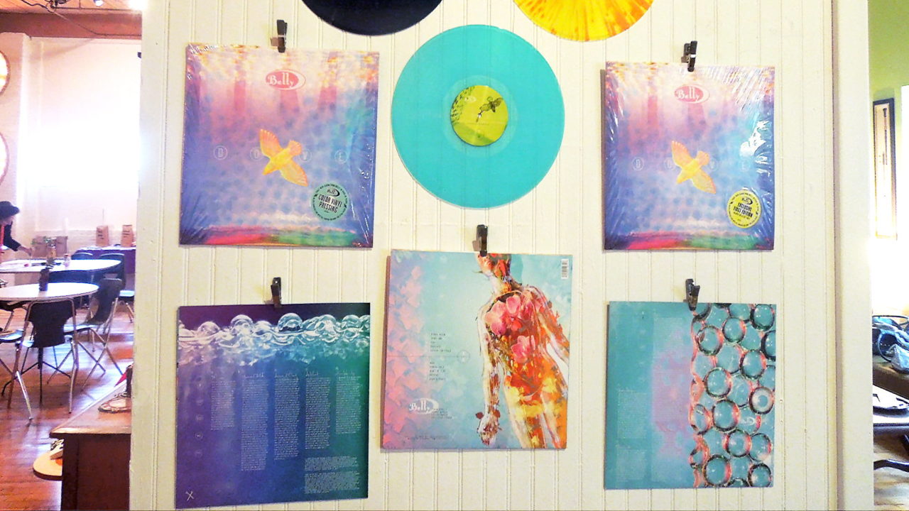
On the back cover we included Gail’s amazing figure study, which adds a nice dichotomy. But I wasn’t happy with the clean type — it was missing a human touch element. Then I saw Tanya’s hand-written song titles. Problem solved. She really should have her own font.
CHIL: Lots of things! Many are too busy, or too dark or poorly executed. I tried a few type solutions for the word dove that didn’t end up getting used. Chris had some cool tree branch images that showed up vaguely on the back cover of Feel that he did end up using later in the video for “Shiny One.”
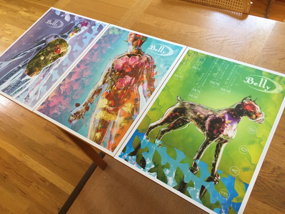
I love how seamlessly the artwork uses photos, digital/illustrative treatments and builds them into patterns, particularly on the posters designed for the different legs of the tour (with a special canine green man for Boston’s show). How long did it take to find the “look and feel”?
CHRIS: I tend to always think/work in a series as an “artist” anyway — this came in handy as a commercial photographer as clients are always looking for a range of options.
The green man concept is unique, fun and pretty so finding different variations of the figure seemed like a great visual way to go, but I felt like it couldn’t just be this one plastic man with different angles or contents or it would lose its impact.
I knew there was a visible woman but the animals were a really cool discovery. Tracking down these vintage models started out as a challenge but POP: Emporium of Popular Culture in Providence actually had the dog and the frog in their basement! It was an awesome coincidence, because I was at Pop discussing the Dove listening party, and [owner] Darren knew exactly what I was looking for.
Progress sketches from the artwork for DOVE. Pop Listening Party, 2018.
CHIL: For Feel, the first piece created, we decided to go with a smaller 10″ record that felt unique, like a collectible. I played with several concepts for the man on the cover that would resurface later, but circled back to the clean pink and yellow atmosphere from Chris’ original photo. The call-out letters are reminiscent of 17th century physiology illustrations, but with the flora man they get a new space-age twist — that’s why the letterforms are familiar but slightly off. Gail and I started calling this alien autopsy.
On the back cover we included Gail’s amazing figure study, which adds a nice dichotomy with the dude. But I wasn’t happy with all the clean type — it was missing a human touch element. Then I saw Tanya’s hand-written song titles on a sheet that was being passed around for sequencing on the album. Problem solved. She really should have her own font.
The evolution of the posters started early on. While working on initial Dove cover concepts, Chris gave me a pattern of birds as a simple black and white design. I tried incorporating them with different images hoping for an Escher or Magritte aesthetic but they felt too rigid and militaristic. Definitely off the mark. After playing with color and distortion I was able to find a combination that added nicely to the story. Once I found that combo I was anxious to apply it to the other “visible” figures to hopefully create a theme. The posters were a great application for them.
Follow Belly on Twitter + Instagram — and don’t miss them on tour!
