When Lush called it quits after a brief but successful 2015-16 reunion, the big question was: Would vocalist/guitarist Miki Berenyi keep playing music? (She left music almost completely after Lush drummer Chris Acland’s unexpected suicide in 1997.)
The answer arrived late in September 2018, when the following message appeared on Lush’s Instagram page: “Miki has a new band! Follow @piroshkaband on Facebook, Twitter, and Instagram!”
The band’s first official Tweet included a photo of 4 familiar faces (provided one is well-versed in the history of 4AD, shoegaze and Britpop) and the text, “Welcome to Piroshka — Mick, Moose, Miki and Justin. We’ve all been in bands before, y’know.” (Roll call: Mick Conroy from Modern English, one of the first bands on Lush’s label 4AD — and a great friend of Acland’s; Moose, aka KJ McKillop from jagged psych-melancholists Moose; and Elastica drummer Justin Welch, who played drums for Lush’s reunion EP and gigs.)


But don’t call them a supergroup. And don’t pull the inevitable band algebra to try to figure out the resulting sound — you know, “Piroshka equals Band X + Band Y squared – the square root of P…” Given the weight of their collective histories, the new band seems determined to keep the music relaxed, informal and not weighed down by previous critical responses.
The name Piroshka (pronounced prosh-KA) is taken from the Hungarian version of Little Red Riding Hood. (It’s a nod to Miki’s Hungarian heritage, and perhaps to the metaphorical darkness apparent in the lyrics of the first single, “Everlastingly Yours.”)

I was interested in the idea of a mood board of various images, a collision of random photographs, so the viewer or listener could make their own narrative. “What does a giraffe, tree and an umbrella mean? Are they a PIROSHKA?”
Tweet #2 unveiled the gorgeous Piroshka logo, which was designed by v23’s Chris Bigg, whose history with Miki’s band Lush began with their very first 4AD EP (1989) and continued through their 2015-16 reunion.
Soon after the finished logo, additional visual c(l)ues began to arrive in the form of Instagram posts by Chris Bigg:
- an all-analogue paste-up of the penultimate logo, crafted from “cut, paste, tape, bleach, pencil and love!”
- teasers of animal mascots (bear, giraffe) enlivened with fuchsia scrawls
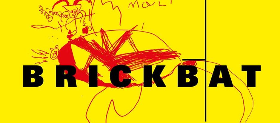
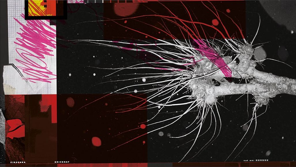
- album art for the debut, Brickbat, to be released in February 2019 by Simon Raymonde’s label, Bella Union
Piroshka’s music is inevitably going to be dissected at length, so I asked Chris Bigg to share his process of creating the visuals, which were created in collaboration with Martin Masai Andersen, an animator, designer and filmmaker who has worked with Bigg on many projects, including the Breeders’ All Nerve and the most recent Geniuser LP.
Tell me when you first heard about Piroshka.
Chris Bigg: Miki phoned out of the blue, asking if I would be interested in a new project. Songs were recorded but mixing was about to take place, so there were a number of tracks to listen to.
What was the initial prompt from the band as far as the look that they wanted? What did you start to work on first?
It was essential for me that the campaign did not relate to any of the previous Lush artwork. That was the most important way to progress.
I was interested in the idea of a mood board of various images, a collision of random photographs, so the viewer or listener could make their own narrative. “What does a giraffe, tree and an umbrella mean? Are they a PIROSHKA?”
While all the band members come from 4 various bands, they are individuals, of course — what if they bought an image each to the project? How would that work?
Once the layout had a basic structure I felt it needed a further layer, something expressive. My calligraphy would have been too obvious — I felt it needed something more naive, random. I mentioned this to Martin Andersen and he said his daughter Mali (age 4) had been making some great drawings of animals. Perfect! We have used a lot more of her drawings in the video — I am excited about that.
![]()
The logo has the uncanny feel of an antique typeface that’s undergone some sort of digital glitch — what was the inspiration there?
The word PIROSHKA sounded very exotic to me, East European. As a student and in the early days of working with Vaughan Oliver, the art of Polish posters, vernacular shop typography, street signs, and of course the mysterious world of the Quay Brothers, introduced me to a beautiful typographic world.
A few weeks before Miki called to ask my involvement, I had bought a drawer full of brass letters from a local vintage shop. They had purchased the job lot from an iron mongers that was closing down. To my amazement, one of the few words I could spell was PIROSHKA (with the help of turning a G upside down to make an A!).
I photographed these letters, printed them onto graph paper and started a very loose composition. I wanted to feel like it had been found — does a street, bar, club exist called PIROSHKA?

These days, you teach in addition to your ongoing design practice. You’ve spoken about how important it is for students to learn to “let the accident in” and not to fear failure. How do you push your own design boundaries with each project?
I start all projects with an analogue response, be it mark-making, photography, cropping, screen printing, etc.
Behind every project is a pile of experiments that never make the final edit. These go into a drawer in the studio for another day. Actually, the Piroshka project was born out of random collage experiments that were a pre-session for the Breeders All Nerve album. I can’t sit at a computer all day, I need to make physical work to get the creative process started.
Tell us about the origins of the band’s ursine mascot. (I made the early assumption that “piroshka” means bear in Hungarian, but that isn’t the case.) Any versions that didn’t make the cut?
All the images are selected from the photographic archive of Martin Andersen. We have worked together on a number of projects in recent years, we teach together and are continually talking and sharing ideas. It’s a very rewarding collaboration — his work and attitude is always an inspiration. The images used for the PIROSHKA project are from his archive of continual observations from the every day. It was a real privilege to explore this fantastic portfolio and take what we wanted to make this project.
In the post-Ivo years, you have continued to work with 4AD. Although Piroshka is independent of the label, the band members have ties to 4AD. In what ways is it freeing or creatively advantageous to work with the band outside the 4AD system?
My years at 4AD were an inspiring time — and still is, on the few occasions I get to work with the new team. For example the recent Breeders project started independent of 4AD. Kim was going to release without a label, but as the music and art progressed she decided to see if a select number of labels might be interested. Of course 4AD offered a deal that suited the project.
Over the years I have enjoyed working on many various projects outside of the 4AD umbrella. Exhibition design for the Museum of London and the V&A was certainly a challenge. Possibly my favourite project was Hypergraphia for David Sylvian, which encompassed his collected written works as well as a journey through the various visual languages he has used over his career.
Teaching in recent years has and an important effect on my working process — and in turn that has inspired how I talk with my students about their work.
Follow Piroshka on Instagram, Twitter and Facebook. You can pre-order Brickbat via Bella Union. Watch their first video, “Everlastingly Yours”: