

Graphic design legend Vaughan Oliver (4AD/v23) passed away on December 29, 2019 at the age of 62.
Early on Sunday, December 29, Adrian Shaughnessy of Unit Editions announced, “My friend and design hero Vaughan Oliver died peacefully today, with his partner Lee by his side. Vaughan Oliver, 1957-2019.”
I had a moment of intense disbelief, followed by the ludicrous hope that it was a sick joke of some kind. As the news sank in, I still couldn’t believe it — intense, profane, puckish Vaughan, one of if not THE iconic designer of the 1990s (sorry, Carson, it ain’t you) — was gone far too soon.
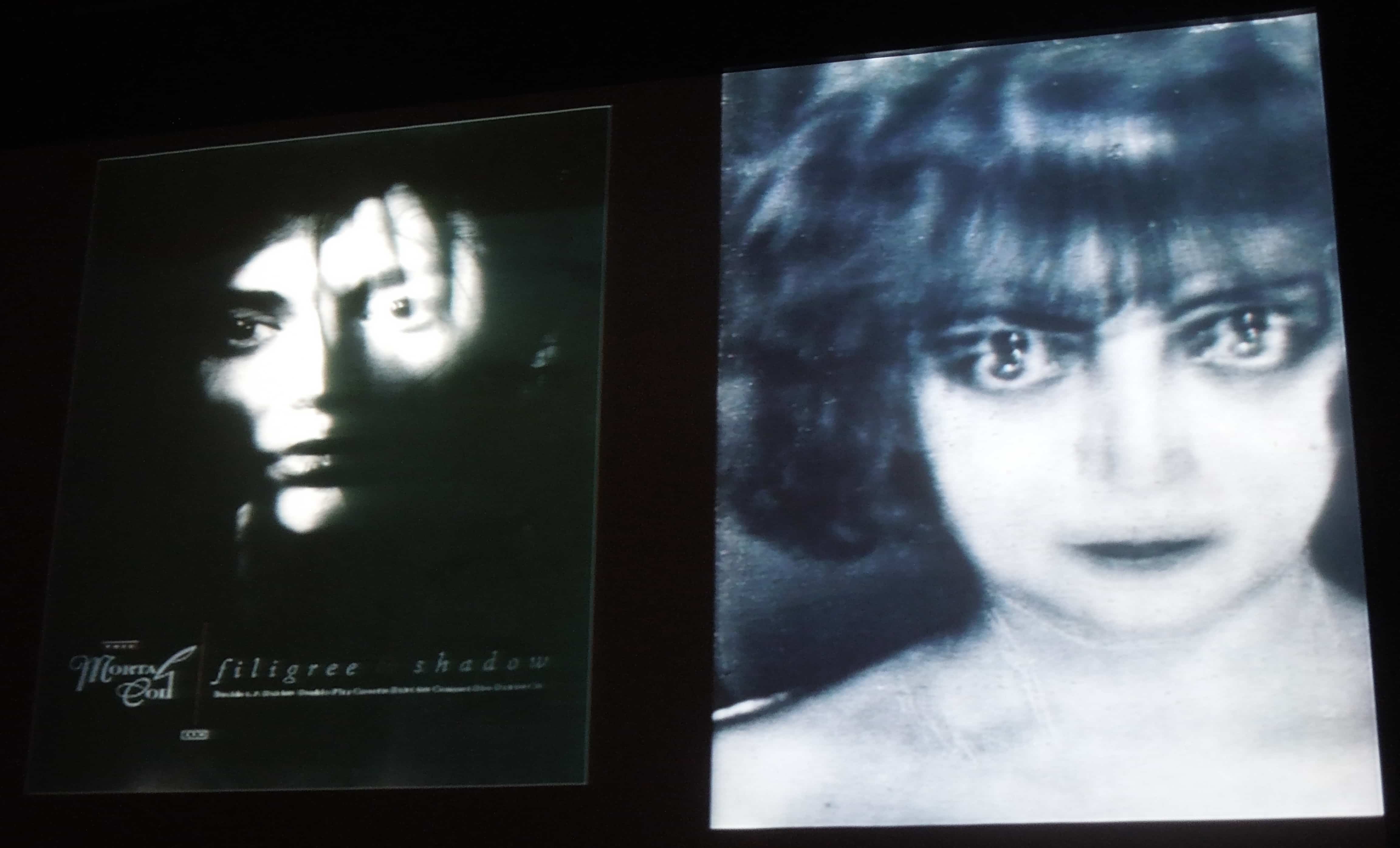
To me, Vaughan Oliver’s work consistently acted as the grit in the oyster — work that enervated, puzzled, inspired and awed. Although the gauzy quality of his early work for the Cocteau Twins — much of it done in collaboration with his first design partner, Nigel Grierson, as 23 Envelope — has almost come to define the “4AD look,” his actual body of work encompassed a wide range of styles, moods, and media.
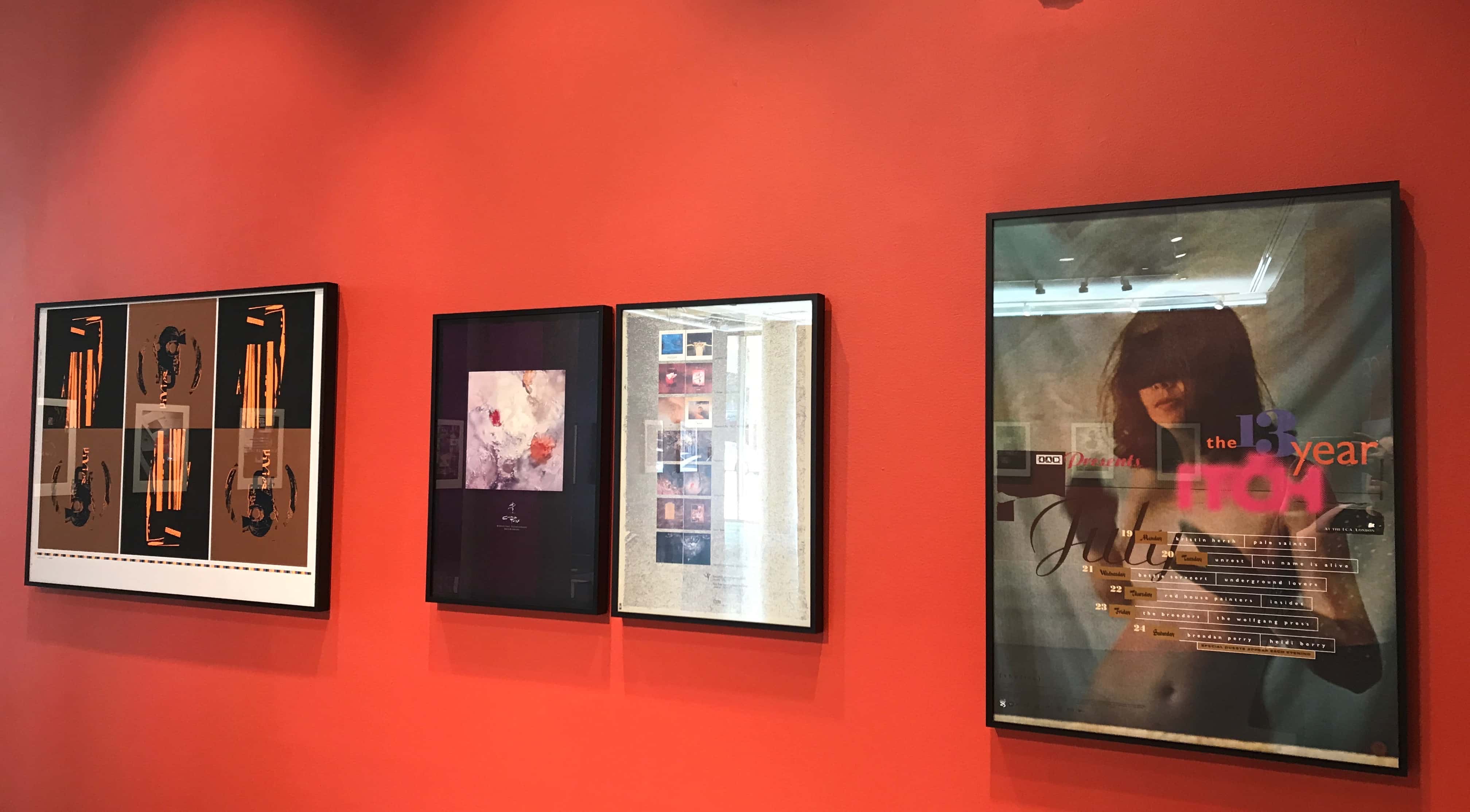
I first met Vaughan on my inaugural trip to London in 1993, where I was attending 4AD’s lavish 13 Year Itch celebration — an anniversary blowout complete with music, an exhibition of artwork, and video screenings at the ICA. To say that I was intimidated by him was an understatement, but his jovial directness was disarming and put me at ease. (To this day, I still haven’t deciphered what he scrawled in my copy of the 1990 French catalogue of his work.)
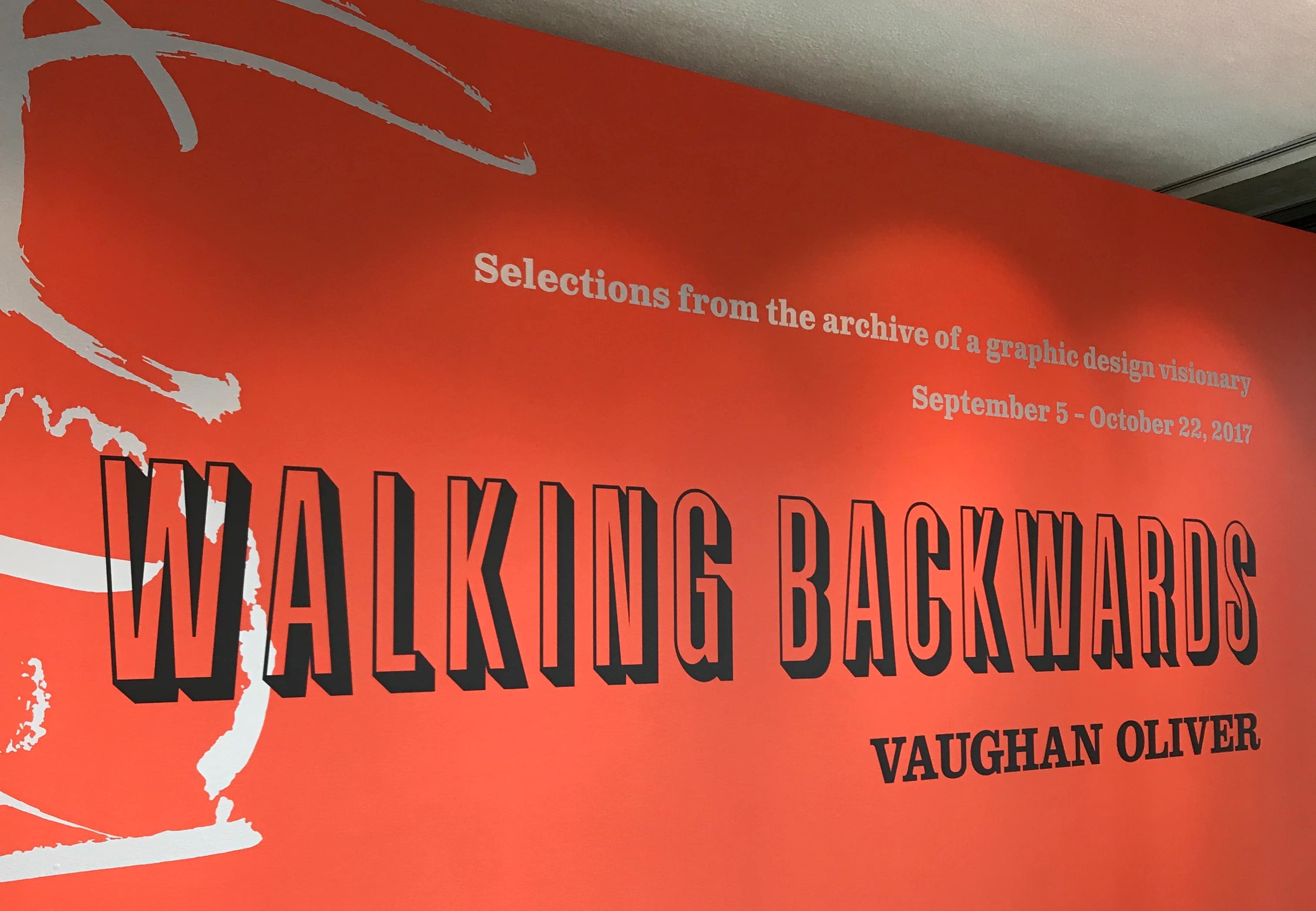
Vaughan Oliver retrospective exhibit at Lesley University, Sept-Oct, 2017
Vaughan’s work for 4AD, in particular, was widely imitated. For a while in the ‘90s, there was a veritable avalanche of indie-hopeful LPs featuring ambitiously cropped sepia photographs and a few carefully-chosen outré fonts. But Vaughan, for all his multitudes as a designer, was never cheap, and he was never, ever arch. Now, he wasn’t above going for the occasional lowbrow visual pun (the Breeders’ “Cannonball” single almost ended up with a back cover featuring a lone testicle “pushed through a piece of board to ensure its loneliness,” read Vaughan’s design brief), but his finished work always tempered that punk sense of boundary-testing with a gracefulness borne of years of honing his craft. (I repeat: His work was never cheap, in both senses of the word. Think of the cover of Ultra Vivid Scene’s debut, where the silver swathes of packing tape obscuring the type were impasto’ed heavily enough to mimic actual packing tape.)
Although the gauzy quality of Vaughan’s early work for the Cocteau Twins has almost come to define the “4AD look,” his actual body of work encompassed a wide range of styles, moods, and media.
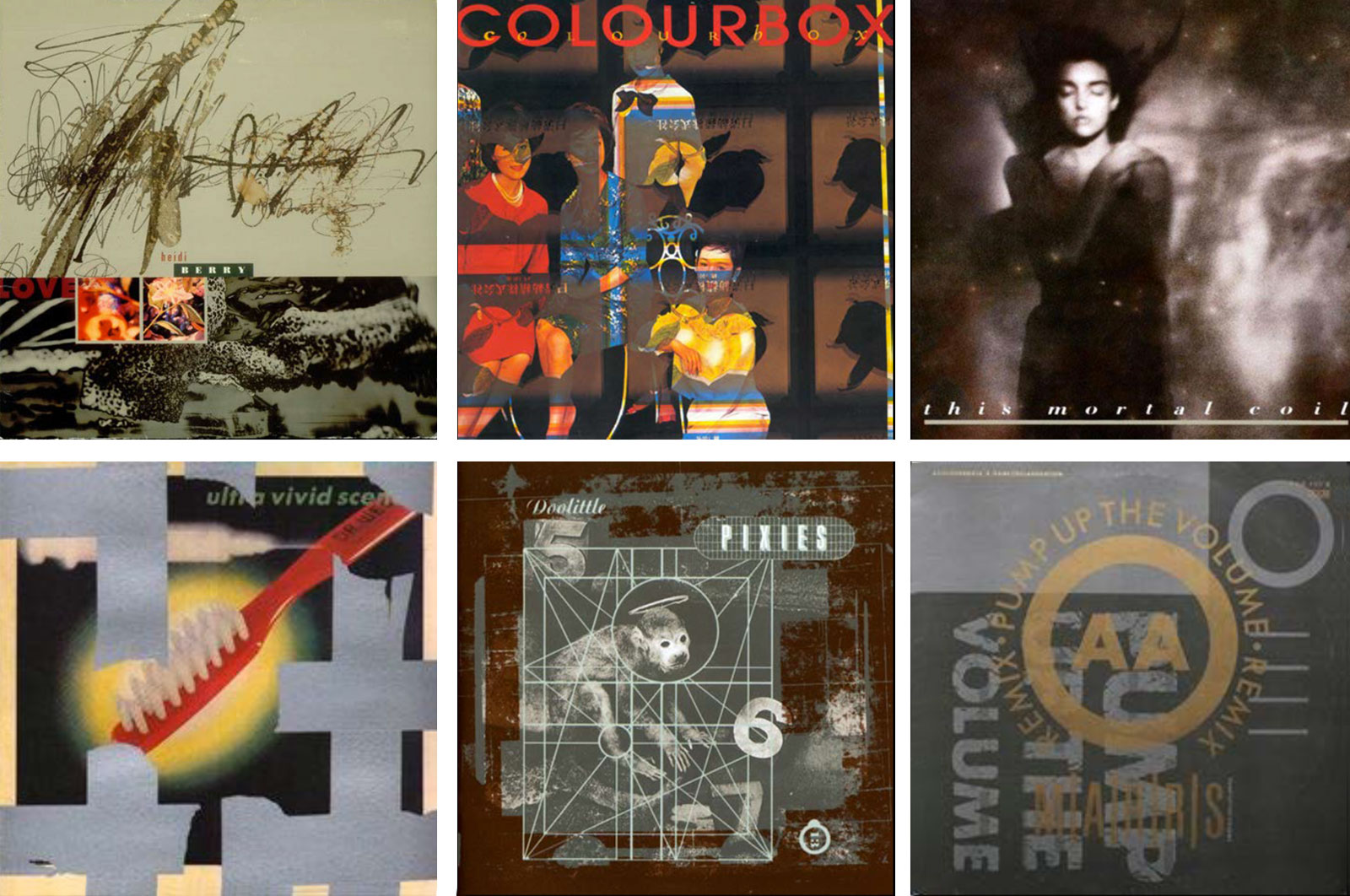
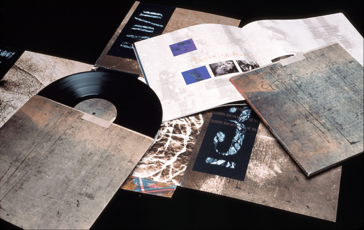
Iconic v23 sleeves from the classic era, clockwise from left: Heidi Berry, Colourbox, This Mortal Coil, M/A/R/R/S, Pixies, Ultra Vivid Scene.
While Vaughan’s designs can certainly stand alone, to me they are twinned to the music. As a 4AD fan, it would be impossible for me to separate the two. (And I do not mean to gloss over his many, many collaborators — that’s for a much longer piece, however.) In some ways, it’s impossible for me to separate Vaughan’s outsized personality from the work. Impishly, he appeared in many guises in 4AD artwork over the years — that’s him, on a Sunday afternoon with a belt of eels from the local fish market, on the cover of the Breeder’s “Pod” (1990). His 1978 wedding photo appears on the back of His Name Is Alive’s “Universal Frequencies” EP (1996). And yes, the sculptural head adorning Clan of Xymox’s “Medusa” (1986) is him, too.
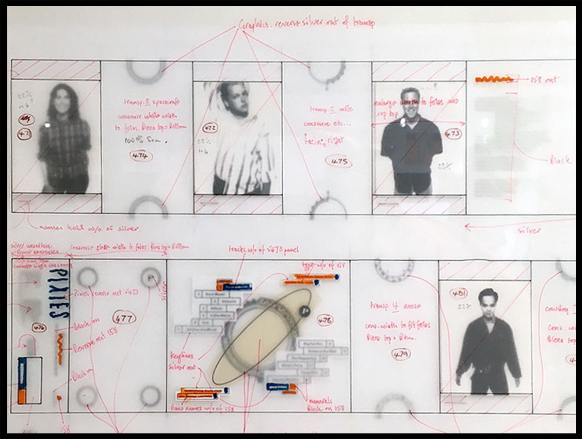
Vaughan’s mark-up for the Pixies’ Bossanova. Courtesy of Timothy O’Donnell.
The last time I saw Vaughan was in 2017, at Lesley University’s “Walking Backwards” exhibition of work from Vaughan’s archive. The exhibit was a wonderful overview, and the programming included an evening of tributes from his design peers. (More from 3 of those designers, Timothy O’Donnell, Clif Stoltze and Kristina Lamour Sansone, below.)
Vaughan declined to speak publicly that evening, although he graciously signed books and posed for photos. It was only in retrospect that his in-plain-sight redaction from the proceedings seemed unsettling. While he alluded to some ongoing health issues, he was in fine form at the post-symposium dinner, which took place in Harvard Square. It was so lovely to catch up, however briefly. I fully expected to see him again.
I’ve spent much of my adult life collecting, poring over and teasing out meaning in Vaughan’s work. I still recall the thrill when I finally found a copy of “Tokyo Salamander,” his exquisite collaboration with Japanese artist Shinro Ohtake (who also contributed sleeve art to numerous Throwing Muses releases). (This was quickly followed by stark terror that I had spent more money than I had ever spent on ANYTHING prior to that point.)
Thank you, Vaughan — you’ve left us with an incredible gift. We miss you, but in many ways you’re still with us.
KRISTINA LAMOUR SANSONE
My Swiss-based graphic design education in the late 80s consisted of crafted constraints. Sophomore year we were asked to create a “sense of order” and a “sense of random” using five 1-inch black dots on an 8-inch white square. Creating randomness in this controlled setting always seemed odd. Can humans control randomness? It turns out we can. I learned that if you vary the spaces between the dots you can steer your design elements to trick the reader to liberate the page and see in a particular way. This study of spontaneity and intuition in the graphic design process led to the discovery of Vaughan Oliver’s work. I studied the science behind his images but its visual logic has always remained a secret.
Pallas Citroen on the cover of This Mortal Coil (left) + Marquise Casati (Man Ray; right)
CLIF STOLTZE, STOLTZE DESIGN
The first 4AD record I owned was This Mortal Coil’s “It’ll End in Tears.” I spotted it while looking through the import section of the Harvard Coop’s record department in the mid-eighties. I knew nothing about the music on it or the record label, but the cover art captivated me. The gorgeous, sepia tone image of a woman, eyes shut in a dreamlike state, coupled with typography on the inner sleeve that combined assorted neo-classical and mid-century kitsch fonts with such intention and precision that I had to have it. Listening to the music for the very first time was an equally memorable experience. One by one, I bought more LPs by the various artists that contributed to that compilation — the Cocteau Twins, Dead Can Dance, the Wolfgang Press, Colourbox.
The lavish Lonely Is an Eyesore compilation. Photo: Clif Stoltze
I clearly remember first spotting another 4AD compilation — the deluxe version of “Lonely as an Eyesore” at Newbury Comics. The record and 24-page booklet came inside an extravagant 4-panel fold-out sleeve that tucked into an outer slipcase. The booklet was a free-wheeling affair with a uniquely-designed spread devoted to each band on the recording. Vaughan later described it as an exorcism of many ideas he had wanted to use, but hadn’t yet had the opportunity. I can’t think of another single disc package that made as much of a first impression on me.
A couple years later in 1989, I helped assemble a New Directions lecture series for the Boston Chapter of the AIGA that included Neville Brody, Rick Valicenti, Rudy Vanderlans and Zuzana Licko (Emigre). I was thrilled when Vaughan accepted our invitation to speak at MassArt as part of the series — it was his first stateside lecture. Promoted heavily through record stores and college radio, it was attended more by alternative music lovers (including Black Francis from the Pixies) than graphic designers. Since then,Vaughan has visited Boston on multiple occasions including a second talk at MassArt in 1995, a presentation at the ICA in 2011 and most recently an exhibition organized by Lesley University in 2017. During each of these visits, I was fortunate to spend time with Vaughan and experience his generous and creative spirit.
The last time I saw Vaughan was Oct. 14, 2017, when Carol and I were in London. Vaughan and Lee [Widdowes, his partner] came into the city to meet us for brunch, followed by a stroll to Magma bookstore and Sir John Soane’s Museum. It was a relaxed and enjoyable afternoon that I’ll never forget.
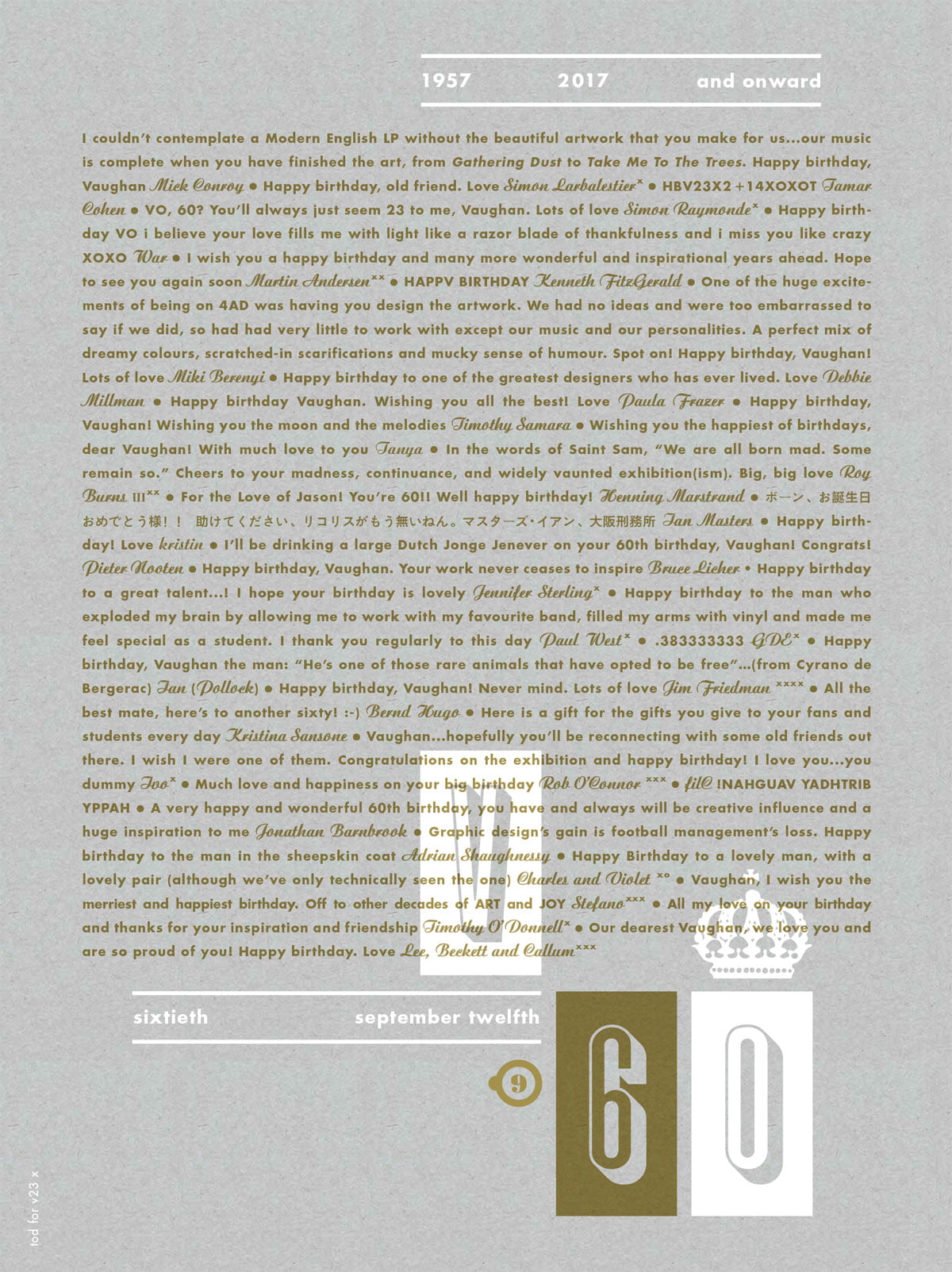
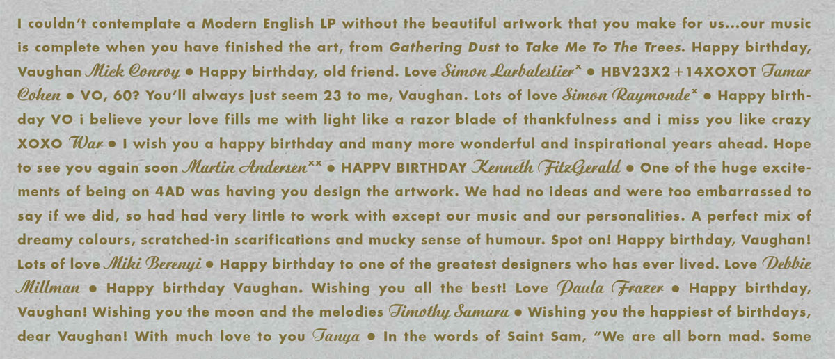
Poster given to VO on his 60th birthday, with tributes from Warren Defever, Tanya Donelly, Simon Larbalestier & others. Design: Timothy O’Donnell
TIMOTHY O’DONNELL
Timothy O’Donnell spent 5 years working with Vaughan, earning design credits on projects for Bush, His Name as Alive, Tarnation and 12 Rounds, among others.

V (infinity): In memoriam graphic tribute to Vaughan by Timothy O’Donnell, who spent 5 years at v23.