The phrase “fucked-up and photocopied” is often used to describe the aesthetic of punk graphics. Imagine visuals that have been chopped, warped, repeated, inverted, and so on, until the meaning becomes distorted and new. While the work of the late designer Vaughan Oliver grew in increasing complexity over the course of his long career, it always retained a certain roughness and the spark, the grit of the imperfect. That fucked-up-ness, if you will. As he himself said of his work with the Pixies (perhaps the band that he will be most associated with, despite working with a broad spectrum of musicians, artists and clients): “You imagine designing sleeves for your own record collection. The David Lynchian moods in there, the black humor, the surrealism — there’s such natural inspiration for me.”

3) Vaughan + Bruce Gilbert (Wire) at the ICA, 1993. (Photo by me)
4) Vaughan and a skirt of eels.
Natural? Or unnatural? Either way, Vaughan never looked to the usual sources to draw inspiration. (And his weapon was often the now-obsolete PMT camera, a crucial ally in making beautiful accidents with type and texture.) “I would take something from Vaughan’s experience and his body of work and think about what happens when you step away from the computer and when you use your hands,” Vaughan’s peer, Adrian Shaughnessy, has noted. “Vaughan certainly advocated the use of hands in his teaching. And I suspect, deep down, he actually regretted the computerization of graphic design. Keep in mind that a lot of the best work was done manually.”
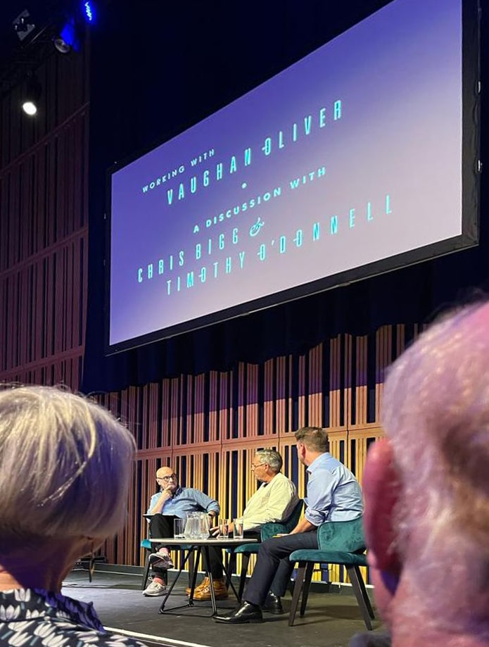
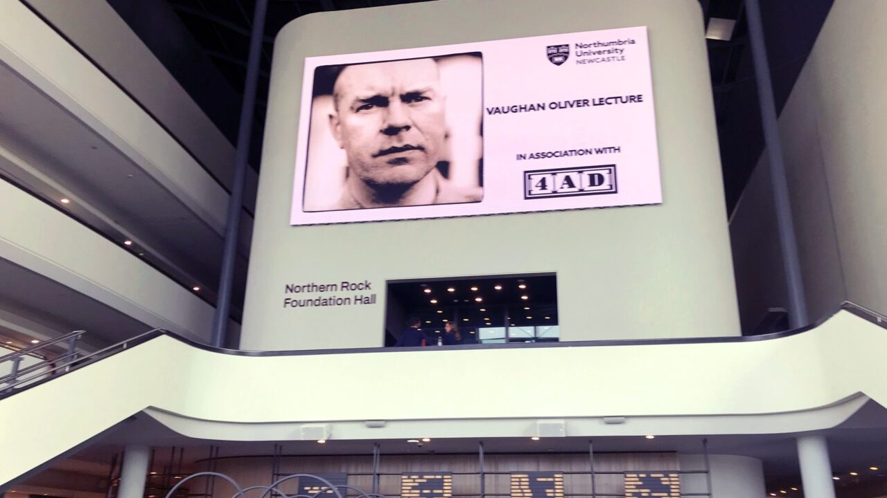
Shaughnessy was just one of the speakers reflecting on the work and legacy of Vaughan Oliver at the Glasshouse (formerly the Sage Gateshead) in Newcastle, UK, on September 14. Vaughan’s v23 colleagues, Chris Bigg and Timothy O’Donnell, also delved deep into their memories of their close-knit, challenging and fruitful collaboration at 4AD, where Vaughan served as the in-house designer for 20 years. The audience represented a wide swath of musicians, designers and photographers whose careers and working methods were forever warped, thanks to their work with the formidable V.O. Attendees included Miki Berenyi from Lush, Anja Huwe and Manuela Zwingman from Xmal Deutschland, artist Russell Mills, photographers Dominic Davies and Kevin Westenberg, Glen Johnson from Piano Magic, and Vaughan’s family, to name but a few. (The lecture also marked the inauguration of the Vaughan Oliver Graphic Design Scholarships, a 10-year initiative supported by 4AD to provide opportunities for talented students to study design at Vaughan’s alma mater, Northumbria University.)
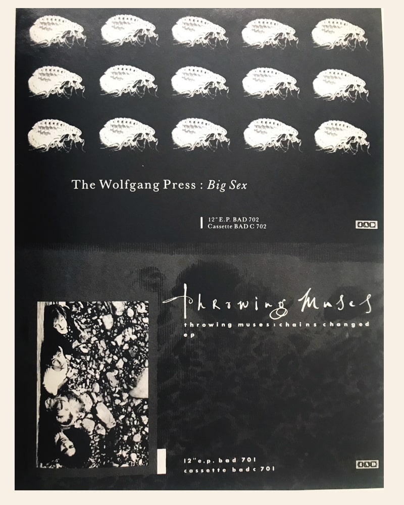
One of the reasons Vaughan’s work doesn’t “date” comes down to his careful layering of many elements — calligraphy, photos, illustration, hand-drawn elements, type from unexpected places — in a way that makes the timeframe hard to identify. “His typographic influences were the vernacular,” Shaughnessy explained. “He wasn’t interested in the standard stuff that we all get, the obvious catalogs. He was interested in old type specimen sheets. He’d take letters, he’d mix them up, all by hand, and he assembled them and make these strange, strange typographic concoctions. … He distorted letter forms to create new hybrid shapes. Letters were hand drawn, scratched out of emulsion. Something I really admired about Vaughan was his use of script typefaces. It’s very difficult to use script typefaces and not make it look like greeting cards. But Vaughan and Chris [Bigg] did that.”
WRITER/DESIGNER ADRIAN SHAUGHNESSY
“His typographic influences were the vernacular. He wasn’t interested in the standard stuff that we all get, the obvious catalogs. He’d take letters, he’d mix them up, all by hand, and he assembled them and make these strange, strange typographic concoctions. … He distorted letter forms to create new hybrid shapes.”
Amongst the fervent praise for Vaughan’s methods, all of the speakers also acknowledged that Vaughan’s often prickly, stubborn and plain mercurial personality could make working with him a unique — but worthwhile — challenge.
Chris Bigg came to work with Vaughan in a somewhat wayward fashion. Vaughan very kindly agreed to do an interview for Chris’s university dissertation, and the two stayed in touch. Vaughan attended Chris’ senior thesis show and wrote in the guest book: “Very impressive, Christopher. Let’s see more in SW18, Regards, Vaughan 23.” (SW18 is the postcode for 4AD’s headquarters in Alma Road.)
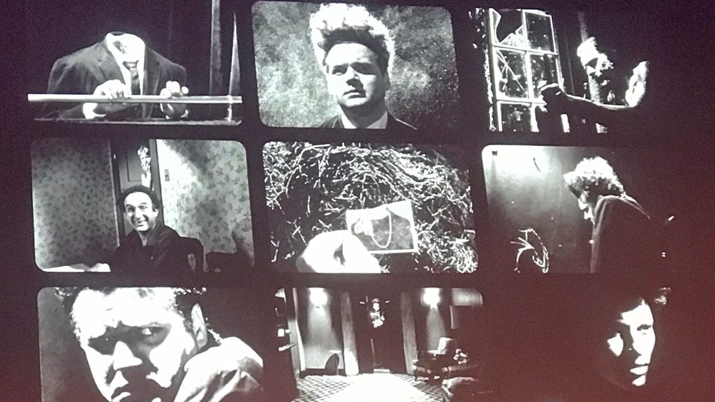
With nothing open at 4AD initially, Chris first went to work for Rob O’Connor’s design studio, Stylorouge — an eye-opening and inspiring time. After roughly a year, Vaughan broke his leg and put a call out to Chris to help him out while he had limited mobility to manage the hulking PMT machine in the basement. (The studio was upstairs at the time.) It was a crash course in a new way of working, noted Chris: “He was hard work, you know. He was a man of high standards. And I was this sort-of nuisance young kid. It was an interesting learning curve. … Our education through school is about, ‘This is my idea.’ And it’s one of the big, big shocks of going out in the world, because we have to talk about our ideas. I would do stuff and he’d say, ‘Why is that good? Why should I use that?’ And it was, it was really challenging. He said, ‘Well, if you can’t tell me, then we’ll just put it over there.’ And then the next day you come in and we wouldn’t talk about that [design], on the bottom. And then you get on and you start. So you’re sort of continually sort of being tested. But during that period, he introduced me to so much.”
(Please let me know if it is yours!)
Tim echoed this sentiment for his own initiation. While the PMT machine had long been supplanted by digital processes for most of the design world, analogue methods still ruled at v23. Until the day when 4AD’s longtime printer demanded that they be furnished with digital files moving forward, and O’Donnell, the new kid on the block, was tasked with bringing the studio up to digital speed. “I honestly hoped I could come work with v23 so I wouldn’t have to work on the computer. And then I show up to work and there’s two Macs and I’m like, ‘Well, who’s using the other one?’ ‘You are.’ Luckily my chair was on wheels and I could sort of spin back and forth [between them] until Chris very quickly got up to speed. But in the very beginning, it was just Timmy Two Macs here.”
v23 DESIGNER CHRIS BIGG
“He was hard work, you know. He was a man of high standards. And I was this sort-of nuisance young kid. It was an interesting learning curve. But during that period, he introduced me to so much.”
Both Bigg and O’Donnell have continued to draw inspiration from Vaughan’s exacting working methods, particularly his way of drawing out the best in all of his collaborators. “The worst thing that you could do as a photographer or designer that was collaborating with him is give him exactly what he’d ask for,” explained Tim. “And I think he really was hoping that you would take the [design] brief — which is usually pretty open — and bring your own thing to it. And he was great at that.”
TIMOTHY O’DONNELL
“The worst thing that you could do as a photographer or designer that was collaborating with him is give him exactly what he’d ask for.”
For the lecture, 4AD unearthed an unused interview clip filmed for the 25th anniversary of the Pixies’ album, “Doolittle.” Vaughan had an uncanny intuition for matching photographers with a band, but no collaboration was perhaps as long-standing or successful as that of Simon Larbalestier with the Pixies. “To me, Simon’s like, a fifth member of Pixies; his aesthetic fitted,” Vaughan explained in the interview. Together, Simon and v23 translated the absurdity and calamity of Charles Thompson’s lyrics into unforgettable images: A welder’s glove. A screaming baby. A line of teeth inside a bell (“As loud as hell/A ringing bell/Behind my smile/It shakes my teeth”). A monkey with a halo. The absurd and the sinister, side by side and vibrating with tension.
Vaughan said of working on “Doolittle”: “The very idea of being here 25 years later is extraordinary. When you are in that moment, at that time and are part of the culture and working to pull this whole project together, you don’t really think you’re going to be ruminating on it 25 years later.” He continued, “Probably the biggest privilege I’ve had, apart from the overall privilege of working with 4AD, is working with the Pixies. This album is their standout album from that period for me. Production is great. Playing’s great. Sounds are great, the chemistry. It’s just an unusual privilege to be part of it.”
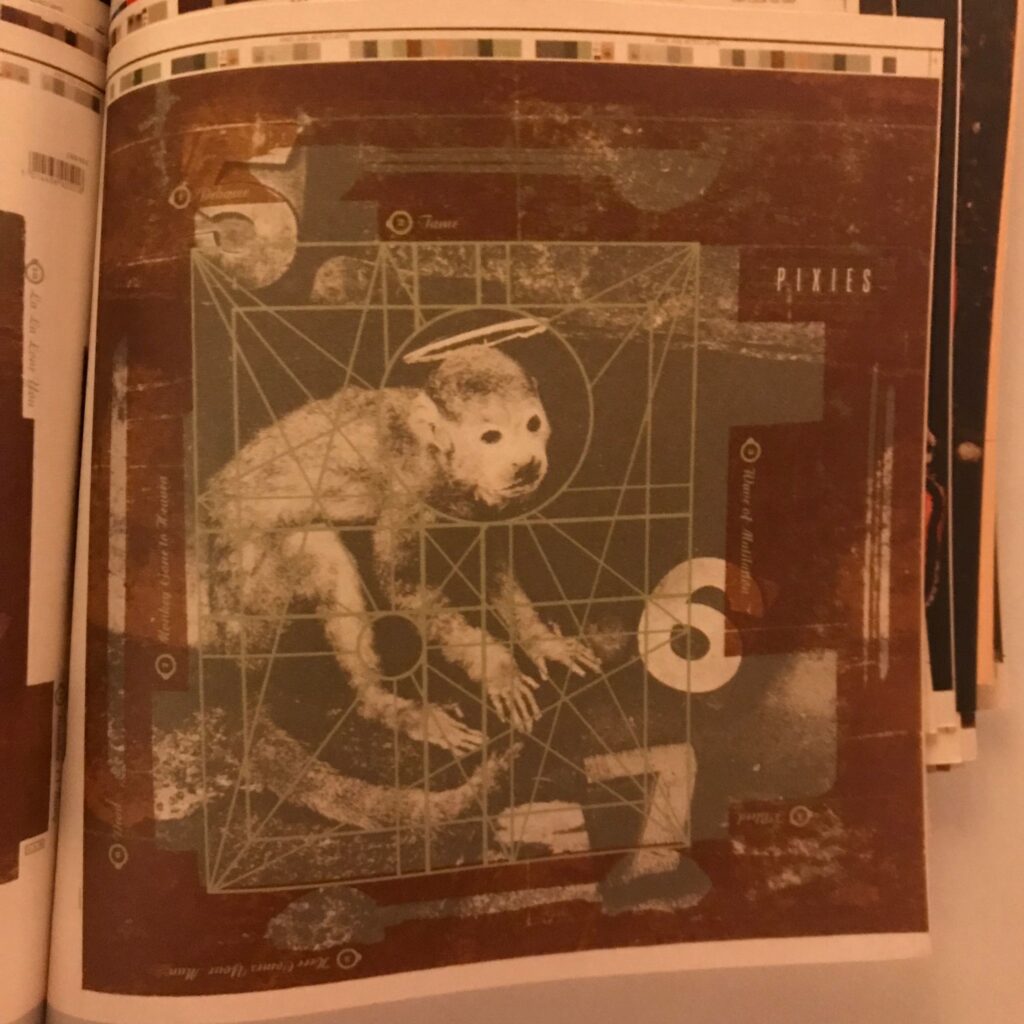
album, Doolittle.
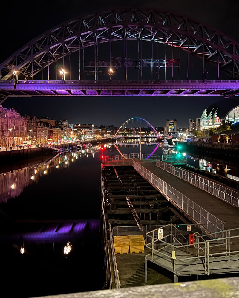
As the evening wound down, all of us headed to the bar to reminisce and catch up. It was one of those evenings where it was impossible to say hello to everyone – it was essentially a 4AD family reunion, and an emotional one, at that. I will say that we shut the place down – even Graham Nash’s fans exited before us. (In a surreal turn of events, the former CSNY musician inaugurated the space’s music hall on the same evening.) The Glasshouse is not a misnomer, and at night, the curving glass front of the building offered a spectacular view of the River Tyne below — with the lights of Newcastle glinting across the way. (Newcastle is full of these tremendous vistas — with so many hills, Georgian edifices and railroad bridges, it’s a bit disorienting and never short of drama.)
If you would like to leave their own memories of working with or knowing Vaughan, please do so in the comments. I would love to add other voices to this story. Thank you!

Luís Filipe da Cunha
Hello, is there any video recording of this event? I would really like to watch it. Thank you very much. Cheers.
andrea
Hi, no, as far as I know, it was not recorded. I hope this post helps evoke what it was like! A truly memorable night.
Martin Percival
Vaughan was a very special person and an incredibly talented artist. My friend Pete and I were delighted to be invited to the evening in Gateshead in September. It was a great evening and I am very pleased that bursaries will be available in future for talented up and coming artists. Vaughan would have absolutely loved that……. possibly even more than a Sunderland win