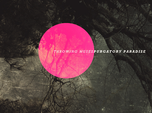
It’s Throwing Muses Week here at Warped Reality (I can hear you now: “Isn’t it always Throwing Muses Week?”) — starting with a sneak peek at the design process behind their beautiful new album, Purgatory/Paradise.
 David Narcizo tackles design problems every day at Lakuna, the graphic design studio he owns with his wife, Misi.
But designing Purgatory/Paradise, the lavish new book of essays + music by Throwing Muses, the groundbreaking band he’s drummed for since 1984, presented a special set of challenges: “I had to be careful not to overthink it,” he tells me over coffee at his Newport, RI studio.
In the 10 years since Muses’ last album, the band has become fully-listener supported with the help of CASH Music, a nonprofit that makes open-source tools for musicians. (Muses singer Kristin Hersh is a co-founder + board member.)
Free from music industry constraints, the band could release music whenever — and in whatever form — they wanted.
And with 32 songs — culled from a whopping 75 — recorded over 10 years, something special was in order.
But what?
It’s one of those great — and daunting — creative questions, acknowledges Narcizo.
“I’ve been lucky enough to have [Throwing Muses] my life for 30 years,” he notes. “Part of that good fortune is the chance to combine my current job (Lakuna Design) with [the band] — it feels like the beginning of another chapter in Muses world.”
Take it away, Dave…
Learn to Let Go of the Past
The Throwing Muses collection Anthology (4AD, 2011) had a complete design that was scrapped.
Early on in the process I shared some sketches with Vaughan Oliver [legendarily cantankerous designer of multiple Muses sleeves].
Now, in the early days of the Muses we were surprised by how off-putting we were to people. We thought if we put photos of ourselves on the sleeve — show we were “normal” — that it would change the perception of us. Vaughan would argue vociferously against it — he always wanted to preserve the mystery.
So with Anthology, I wrote to him and said, “Hey! There’s not a single picture of us in it!” And he wrote back: “What a mistake you’re making!” [laughs]
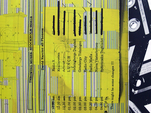
So I scrapped that design and reworked it to include all kinds of ephemera that was personal to the band: tour itineraries, ticket stubs, etc.
Use Process to Take a Step Back
I always design a cover opened. One thing I remember Vaughan saying was, “Don’t worry about the cover too much” — he was basically saying, “The cover doesn’t have to be the main event.” That was freeing to me.
With Purgatory/Paradise, I wanted the cover to have a vintage book feel to it — I wanted the light to feel magical but not spooky.
Prompts Are Good
Kristin sent me a list of words to get me started on the overall look + feel: colors, names, places, objects.
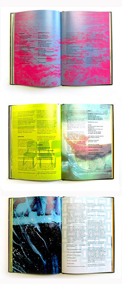 Then I received all the essays. I realized there were a LOT of words.
I knew I was going to need buckets of assets.
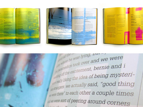
Some of them are mine, some are K’s. I created collages behind the text, some specific to what she’s talking about, some more allusive. I didn’t want to be too precious about it.
There are lots of photos of Newport in there. Like Brenton Point — we joke that it’s our “photographer date spot” because it’s where we ALWAYS took photographers. Chains Changed was shot there.
It was a lot of trial and error until I settled on collage out of necessity — to treat every page like a separate layout.
The intro is more geometric. When it gets into songs the look is more collage-y.
I had to be careful not to overthink it. When it’s about you you’re less willing to go with one idea. I was trying to exercise restraint.
Evolving Beyond the Album (While Still Loving the Album)
One of the things that K and I have been talking about a lot recently is that it’s taken us a long time to get to this place — we’ve evolved past the album.
It’s odd because, almost more than anything else we’ve done, this record really feels like an album.
And yet, at the same time, I feel I’m ready to let go of albums.
I don’t think we have to think in those terms any more — we can record and then, maybe after the fact, decide, “Oh, this all works together as a collection. We’ll package it up and then make it something tangible that people can have.”
Maybe it’s one song, maybe it’s a piece of design —or writing. Releasing “stuff” — whatever form that takes — when we feel like it.
Bands should never break up. We’re always going to be around, in some form.
Shows in 2014?
Bernie [Muses bassist] hurt his thumb, so we’re going to play shows in 2014.
Jeff Craft, our booking agent, is going to try to book us into places that are just unique and fun — like the De La Warr Pavilion [a Modernist-era concert hall] in Sussex, or the Islington Assembly Hall.
The first show that’s been announced will be part of NoiseFest in SF.
Investigate
Throwing Muses on Twitter
Lakuna Design
Cashmusic.org
Kristin Hersh

